A limited palette might seem restrictive at first, but it’s actually a powerful tool that helps artists create harmonious, compelling, and expressive paintings. A limited palette involves selecting a small number of colors that work together to maintain balance and unity while still offering variety in temperature and contrast. This approach helps simplify decision-making, strengthen composition, and enhance storytelling.
Why Use a Limited Palette?
Many master artists, from classical painters to modern impressionists, have used limited palettes to create stronger compositions, cohesive color harmony, and impactful storytelling. By narrowing down your color selection, you develop a deeper understanding of value, temperature contrasts, and color mixing, leading to more intentional and expressive artwork. Let's have a look at some masterpieces for inspiration.

In The Overgrown Pond, Domotkanovo, Valentin Serov features an earthy, muted palette that enhances the sense of depth and tranquility, proving that a limited color scheme can create a rich and immersive scene.
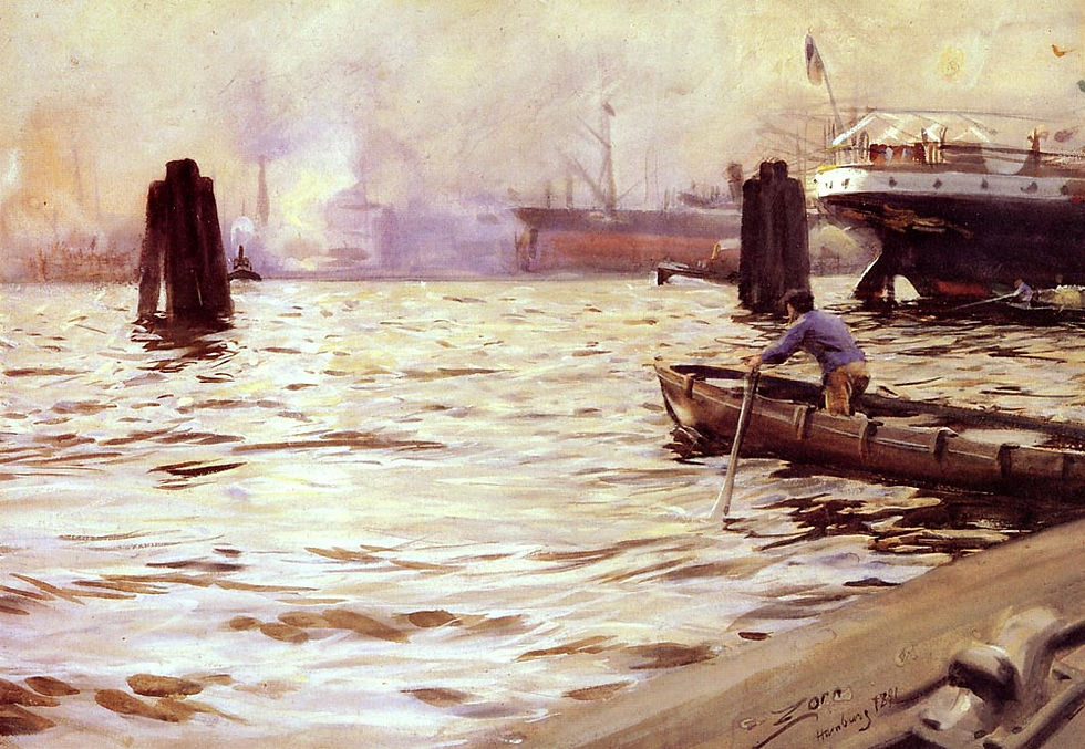
In Hamburg Harbour, you can see Zorn’s skillful use of a limited palette, Particularly with his famous "Zorn Palette" (black, white, red, and yellow ochre), it showcases how subtle variations in tone can depict shimmering light and movement.

In Moonlit Landscape painting, Levitan’s controlled palette of blues and deep greens evokes a quiet, dreamlike atmosphere, demonstrating how a restrained selection of colors can amplify emotion in a painting.
The Artistic Impact of a Limited Palette
Using a limited palette isn't just about simplifying your color choices—it transforms the way you paint and think about your composition. Here’s why it’s a game-changer:
✅ Color Harmony: With fewer pigments, all colors naturally relate to each other, making it easier to create a cohesive and pleasing painting. Rather than struggling with clashing tones, your scene will naturally feel more unified.
✅ Better Value Control: Since landscapes rely heavily on value shifts to convey depth and form, limiting your color choices allows you to focus on the contrast between lights and darks. This makes it easier to achieve depth and a strong focal point.
✅ Stronger Mood & Atmosphere: A well-chosen limited palette can enhance the storytelling of your painting. For instance, warm earth tones with cool shadows can evoke a sense of vastness and tranquility, perfect for a location like Samburu.
✅ Faster Decision-Making: A restricted palette speeds up the painting process by removing hesitation. Instead of endlessly mixing colors, you’ll become more intuitive and confident with your choices.
Selecting the Right Scene for a Limited Palette
Not all landscapes require a wide range of colors. The best scenes for this technique are those that rely on mood, lighting, and structure rather than excessive detail:
✅ Mountain and Desert Scenes – These environments often have subtle shifts in warm and cool tones rather than extreme color variation, making them ideal for a limited palette approach.
✅ Dawn or Dusk Skies – Early morning or evening scenes naturally lend themselves to a simplified palette, where a few colors blended correctly can capture the atmosphere beautifully.
✅ Forests and Fields – Instead of painting every shade of green, a limited palette encourages the use of color temperature and value shifts to suggest foliage and depth.
✅ Coastal & Water Scenes – The natural gradients of sky and water can be effectively captured with just a few carefully chosen colors, emphasizing movement and light.
How to Get Started
If you're new to limited palettes, here are some practical steps to begin simplifying your color choices while still achieving depth and richness in your landscapes:
➡️ Choose a Warm-Cool Primary Palette – A classic limited set includes a warm and cool version of each primary color (e.g., ultramarine blue + phthalo blue, cadmium red + alizarin crimson, yellow ochre + lemon yellow).
➡️ Focus on Value First – Before worrying about colors, establish a strong value structure in your painting. A good test is to check if your painting works in black and white before adding full color.
➡️ Mix Colors Instead of Using Them Straight from the Tube – A limited palette forces you to develop color mixing skills, which enhances subtlety and depth in your painting.
A limited palette is one of the best ways to refine your understanding of color relationships, value, and composition. By working with fewer colors, you’ll learn to paint more efficiently and with greater emotional depth! What to put these information in practice? Join our Weekly Challenge #159, which we are spending in Kenya!
Comments